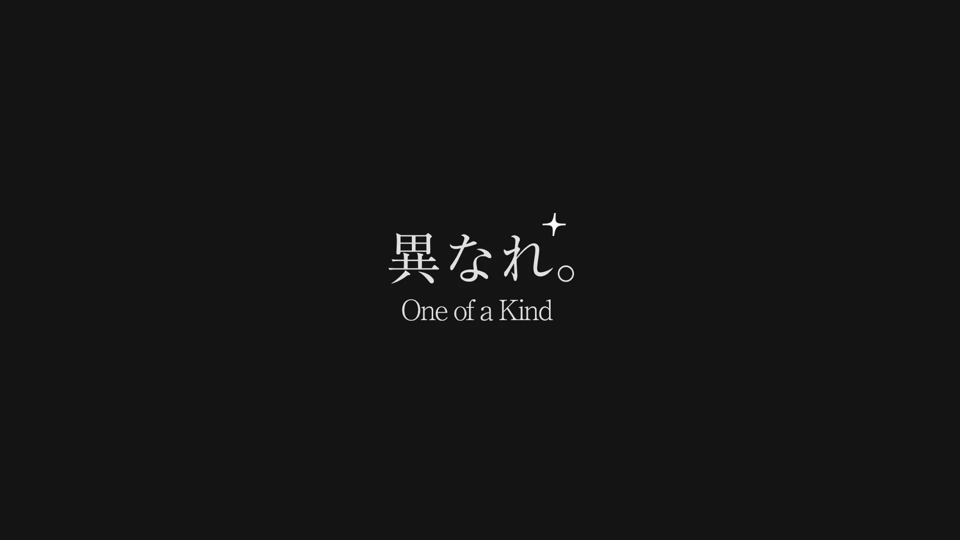
"Be Different. One of a Kind" BX
Introduction
Masayuki Kazawa, who has walked a diverse path — from major finance to professional boxing — shares his unfiltered self on Instagram and runs a 90-day coaching program designed to transform the way people live. I handled the full brand design, spanning brand essence and core value identification, web design, system development, symbol mark creation, brand color definition, and font system design.
Brand Story
To ignite the hearts of those who once wanted to become someone, Kazawa-san began posting on Instagram. The coaching business he offers helps people identify their true strengths and learn — through coaching — how to use those strengths in the right way.
ICP (Target)
A 27-year-old office worker with a strong desire to become someone, but stuck and unable to take action.
Before the Design
Despite being a tightly closed community, it had an intensely loyal fanbase — and had already begun monetizing without clearly stating the business details or service offerings. However, since the content was limited to short-form video, it was difficult for newcomers to understand exactly what services were being provided.
The original contract was only for a website explaining the business, but I was eventually brought in to handle additional design work as well.
Brand Essence & Core Values
Authenticity
The key differentiator from other coaching businesses was showing the unfiltered reality — including moments of vulnerability and failure. Since the Instagram content was about revealing one true self as authentically as possible and identifying who you really are, I carried that spirit of authenticity into the design.
Website
→ Customer testimonials are published exactly as submitted — without any editing or summarizing.
→ The creator darker past is not hidden. I proposed including a detailed biography, and it was incorporated as-is.
Tagline
Be Different. One of a Kind
The word driving the creator was Be Different. Everyone is inherently unique, yet as we grow, we tend to become more like others. This leaves us unable to identify our own strengths, causing us to lose our way. The creator placed himself at the center and valued being different from others. During a meeting, the phrase One of a Kind — from the words of professional boxer Manny Pacquiao — was also shared as a major driving force.
Thinking about what kind of clients would be drawn to this creator motivation, I adopted both phrases as the tagline.
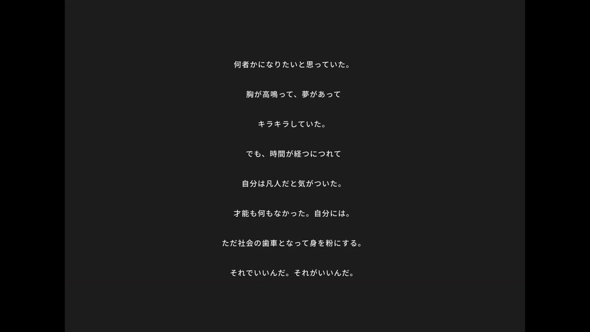
Body Copy
I wanted to become someone.
My heart raced, I had dreams,
and everything sparkled.
But as time went by,
I realized I was ordinary.
I had no talent. Not me.
Just another cog in the machine, grinding myself down.
That is fine. That is enough.
This poem-like copy was written by me, placing myself in the mindset of the client. When shared with someone who had completed the coaching program, they said it hit them deeply — and it was adopted as the website body copy as-is.
Brand Color
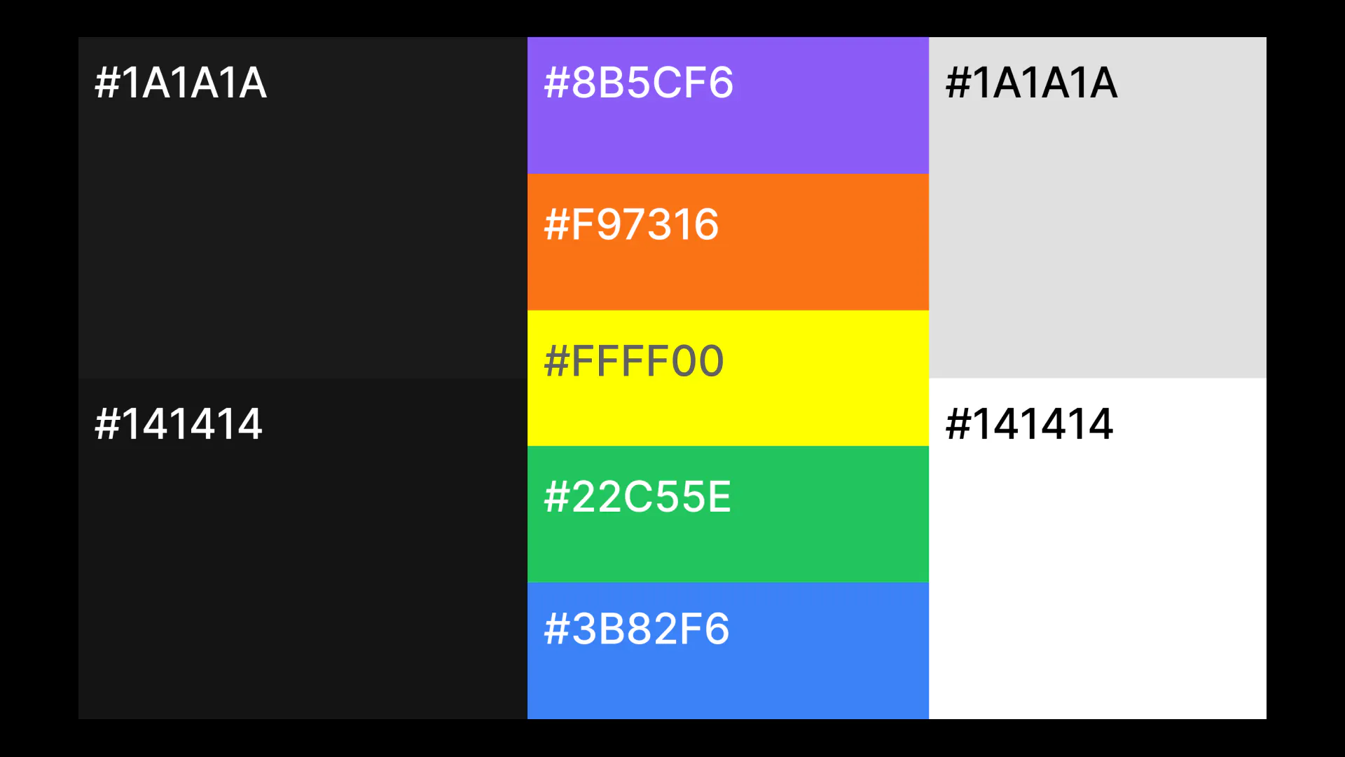
Defined a color system expressing Be Different. with a premium black as the foundation.
Brand colors were established for web backgrounds and Instagram posts. The black differs between PC and smartphone — because the same color appeared significantly different on each device, I fine-tuned the values separately to ensure a consistent visual impression.
Logo
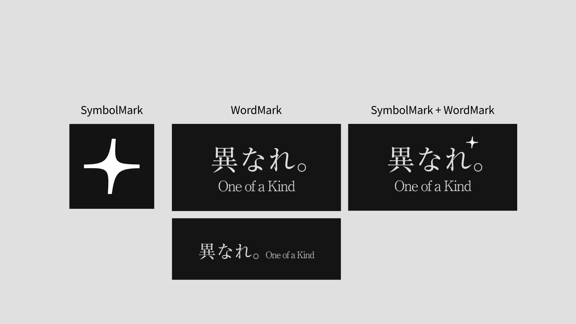
The logo system consists of three variations: symbol mark only, wordmark only, and symbol mark + wordmark.
Wordmark
The logo most suited to the service.
A logotype consisting solely of the words felt like the clearest expression of this service, so it was established as the primary logo.
e.g. Website
Symbol Mark + Wordmark
Used to convey a service feel when there is no surrounding context.
Conveying a service feel with the wordmark alone proved very difficult. This version is used at touchpoints where someone encounters the service for the first time.
e.g. Customer testimonial posts on Instagram
Symbol Mark
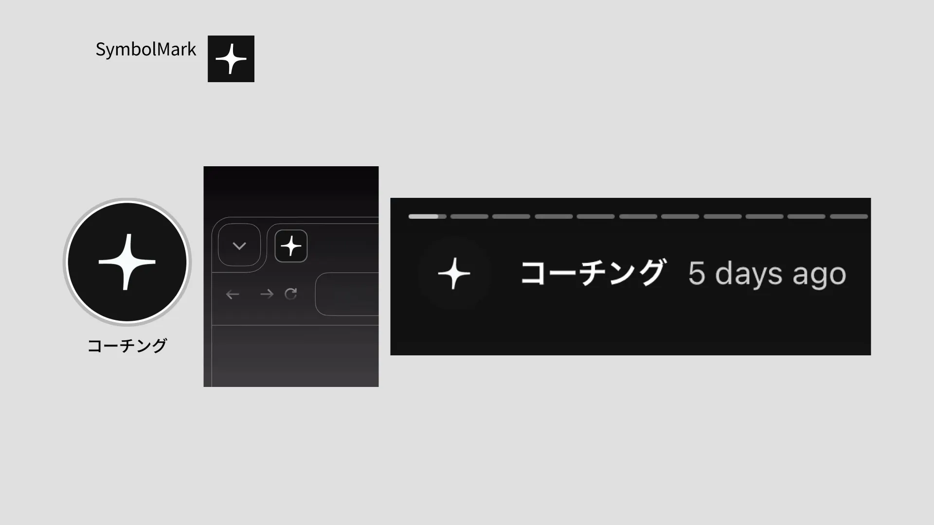
A star-inspired mark, used primarily when the wordmark alone is difficult to display.
Built on a star shape, the goal was to create something simple yet distinctive — achieved by incorporating a superellipse form and a subtle twist.
e.g. Favicon, Instagram archive icon
Website
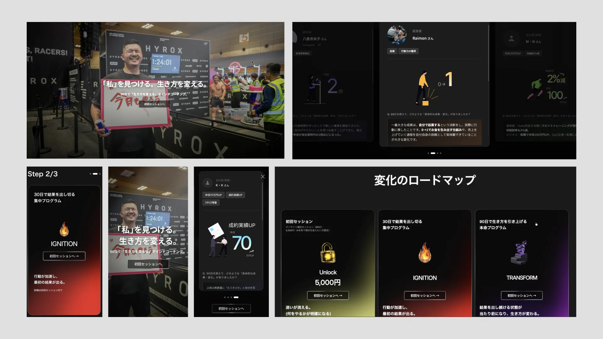
Since the primary traffic source was Instagram — with plans to expand to YouTube — I gave careful attention to responsive design throughout.
Web Analytics
There was a dedicated operator handling analysis and operations who requested Google Analytics and GTM implementation.
To enable detailed tracking, I configured GTM granularly so that each section and every CTA button could be individually identified.
In addition, I integrated Microsoft Clarity to capture actual individual user behavior.
Official LINE
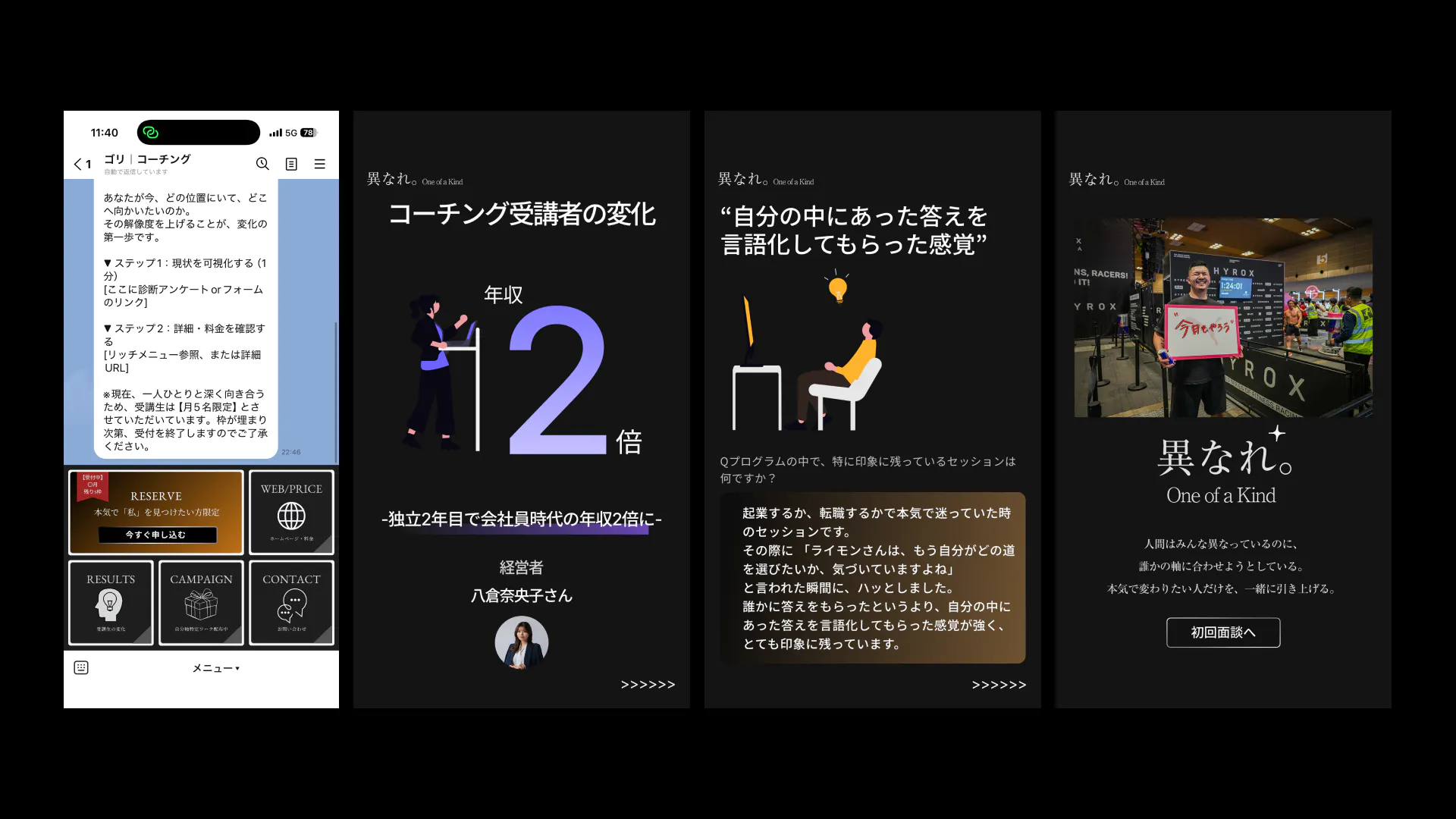
Co-created the official LINE design together with the operator.
The brand color (black) could clash heavily with the LINE default background, so I adjusted the shade to be slightly brighter. To compensate, I made the text bolder, increased white space, and maintained strong contrast to preserve the brand image as much as possible.
SNS Posts
I also designed Instagram posts showcasing the transformations of coaching participants.
System Development
Automated Email System
After a booking is completed via Cal.com, I built an automated email system using Google Apps Script that sends a pre-session questionnaire to the provided email address.