Prism Font & Assets
Introduction
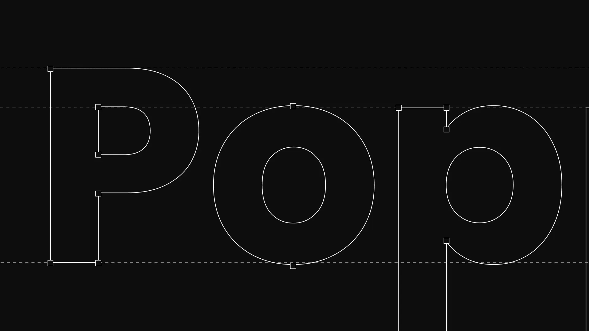
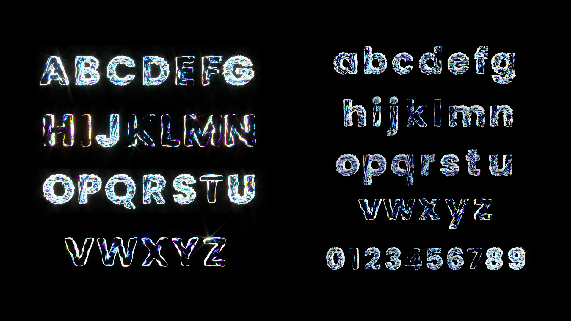
PrismFont is a new typeface based on Poppins.
As 3D design becomes common in many fields from animation to branding, typography still remains mostly 2D.
Even though 3D modeling is not every designer’s strength, once a 3D model is built, it becomes easy to adjust and experiment. Changes that would require redrawing in 2D can be done quickly in a 3D workflow.
I have always been interested in prism-style rendering. But I couldn’t as technological limits. Its light, shine, and sparkle create a unique visual effect. When I decided to create a new typeface, I chose Poppins—one of my favorite fonts—and turned it into a 3D prism form full of light and depth.
What if Poppins's structure was distorted?
Poppins is a geometric sans-serif known for its monolinear, well-constructed design developed by Indian Type Foundry (ITF). It was specifically developed to harmonize Latin and Devanagari scripts, offering a more rationalist structure than many typical fonts.
So, just out of my curiosity, what if Poppins's structure was intentionally distorted?
Approach
The project was created mainly using 3D software such as Blender and Cinema 4D.
No hand-drawn paths were used at any stage of the process.
I took advantage of 3D features as much as possible.
The reflection color and the font colors can be easily changed by adjusting the settings in Cinema4D or Octane Render, allowing a wide range of expressive variations.
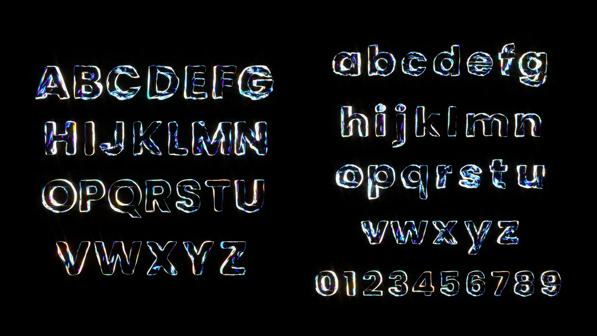
Additionally, as the geometric structure is generated using Blender’s Geometry Nodes, each character can produce up to 90 different forms, enabling subtle adjustments without manual modeling.
Firstly, I started off by disrupting the well-constructed shape of the Poppins font. To generate random shapes, I used Geometry Nodes in Blender, making the fonts move based on the frame rate.
Prototype1
The geometric structure is generated using Blender’s Geometry Nodes, each character can produce up to 90 different forms, enabling subtle adjustments without manual modeling.
Prototype2
I applied a Prism-effect to the distorted font, but the colors didn't render as cohesively as I'd hope. I've gone back to make some further tweaks.
Design
I decided to change the number of Geometry Nodes and keeping render on Octane Render to make it sophisticated. As a result, a typeface with a strong visual effect for each character has been completed.
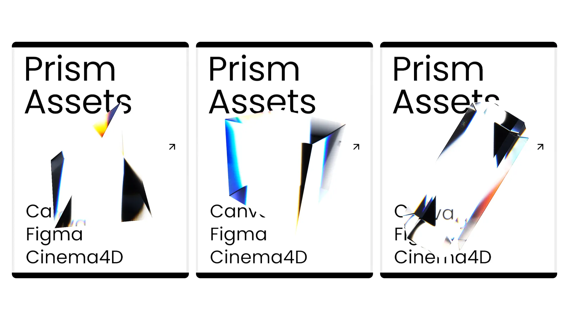
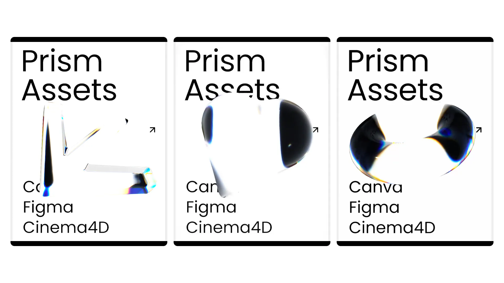
Prism posters
After designing fonts, I explored applying a prism effect to geometric forms, such as cubes, cylinders, and so on. Using Cinema4D and Octane Render, I created a series of animated 3D posters.
I’m creating assets for designers who aren’t familiar with using 3D softwares. The goal is to make these assets easy to use in tools like Canva and Figma, enabling the designers to generate strong visual impact without relying on 3D workflows.