FumiStudioWEBSITE

Introduction
What makes a portfolio that people want to read?
When I created my portfolio, the main issue I faced was "how to make people read the text." The first time I tried building a portfolio, I thought nobody would bother reading the text, so I didn't add any captions. However, it ended up with too little explanation, and nothing got through to viewers.
Especially now that it's easy to create downstream outputs using AI, I wanted to show not only the design approach but also how I tackled upstream processes. My goal was to create a portfolio where people would actually read the text, too.
Approach - Without thought -
Naoto Fukasawa proposed the concept of "Without thought." While this mainly refers to product design that takes advantage of affordance, I thought it could also be applied to digital media. I spent my days wondering what makes people "just read" something, rather than "reading" in the conscious sense.
One day, I read a document released by OpenAI. I realized I had been reading the text as a matter of course, and started to wonder what it would be like if a portfolio's description section was more "blog-like." That's when I came up with the idea for a "blog-style portfolio."

Research
At research institutions, it's often necessary to publish lengthy texts that need to be read by the general public as well. Therefore, I studied the typography of blog articles from OpenAI, Anthropic, and Google as references.
/OpenAI EN
https://openai.com/index/codex-for-almost-everything/
OpenAI JP
https://openai.com/ja-JP/index/codex-for-almost-everything/
Google EN
https://blog.google/products-and-platforms/products/education/ai-tools-programs-educators/
Google JP
https://blog.google/intl/ja-jp/company-news/technology/gemini-31-pro-gemini-31-pro-deep-think/
Anthropic
https://www.anthropic.com/glasswing

Architecture
The chosen font size is 17px. Line height is set to 1.5.
Since the inserted images are targeted for MacBook Air 13-inch and thus have a max-width of 1248px, the text box should ideally be smaller than this. To keep the main text's max-width between 630px and 720px, I set the main text max-width to 1222px. Subtracting 32px of padding on each side and dividing the width into a 12-column grid, I allocated 7 columns to the main text and 2 to headings. With this setup, the main text's max-width becomes 675.5px (the average of about 630px and 720px). This should result in comfortable readability.
How is it… Is it easy to read…?
*(720+630)/2= 675px
1200px divided by 12 = 100px per division
675px ≒ 7 divisions
675/7*12 +32px×2 = 1,221.1428571429px ≒ 1222px

FumiStudio WEBSITE
WEB/UIUX, BRANDING
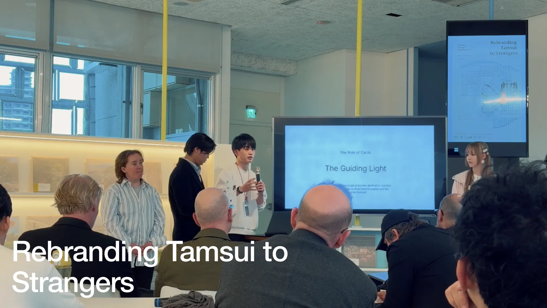
Rebranding Tamsui to Strangers GDI2026
BRANDING
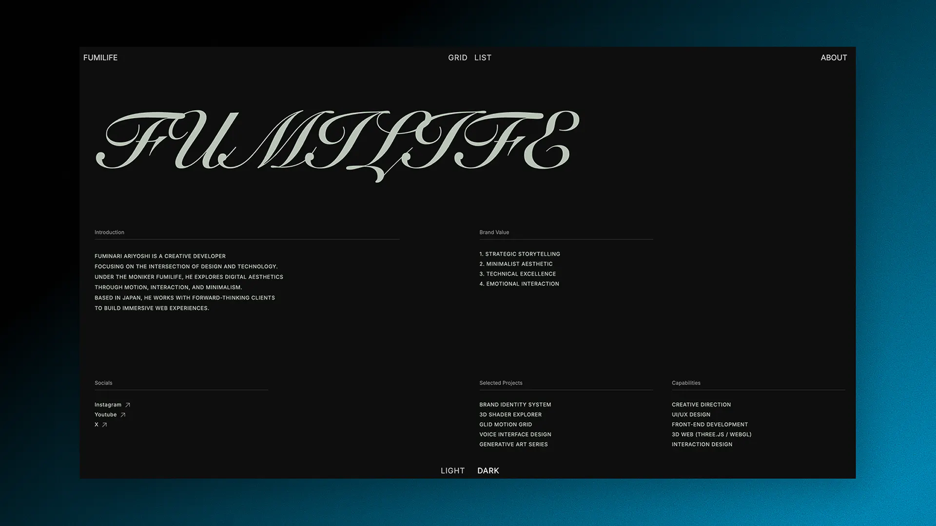
FumiLife Project
WEB/UIUX
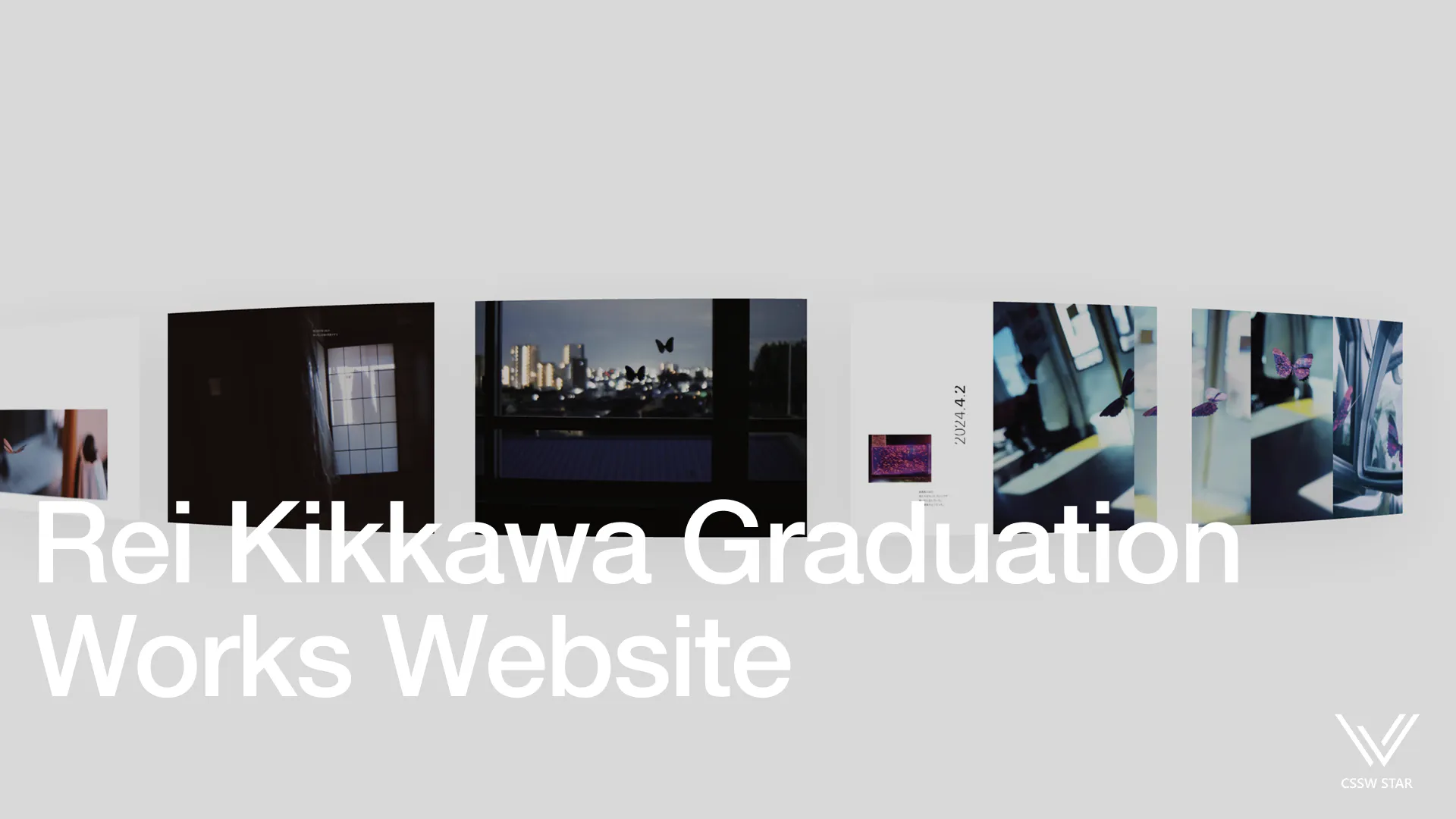
ReiKikkawa Graduation Work
WEB/UIUX, ClientWork
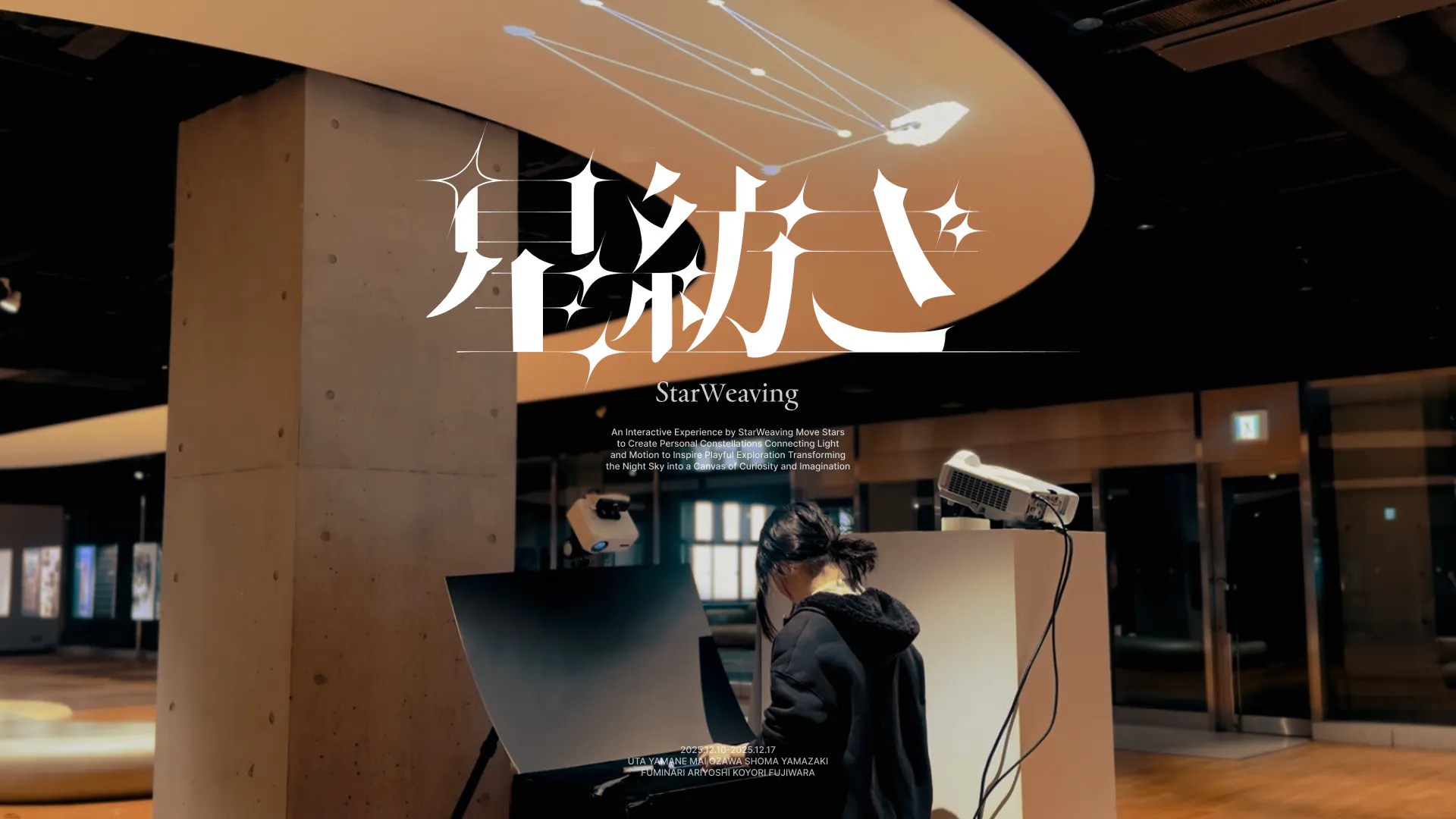
StarWeaving
BRANDING, Experimental Work
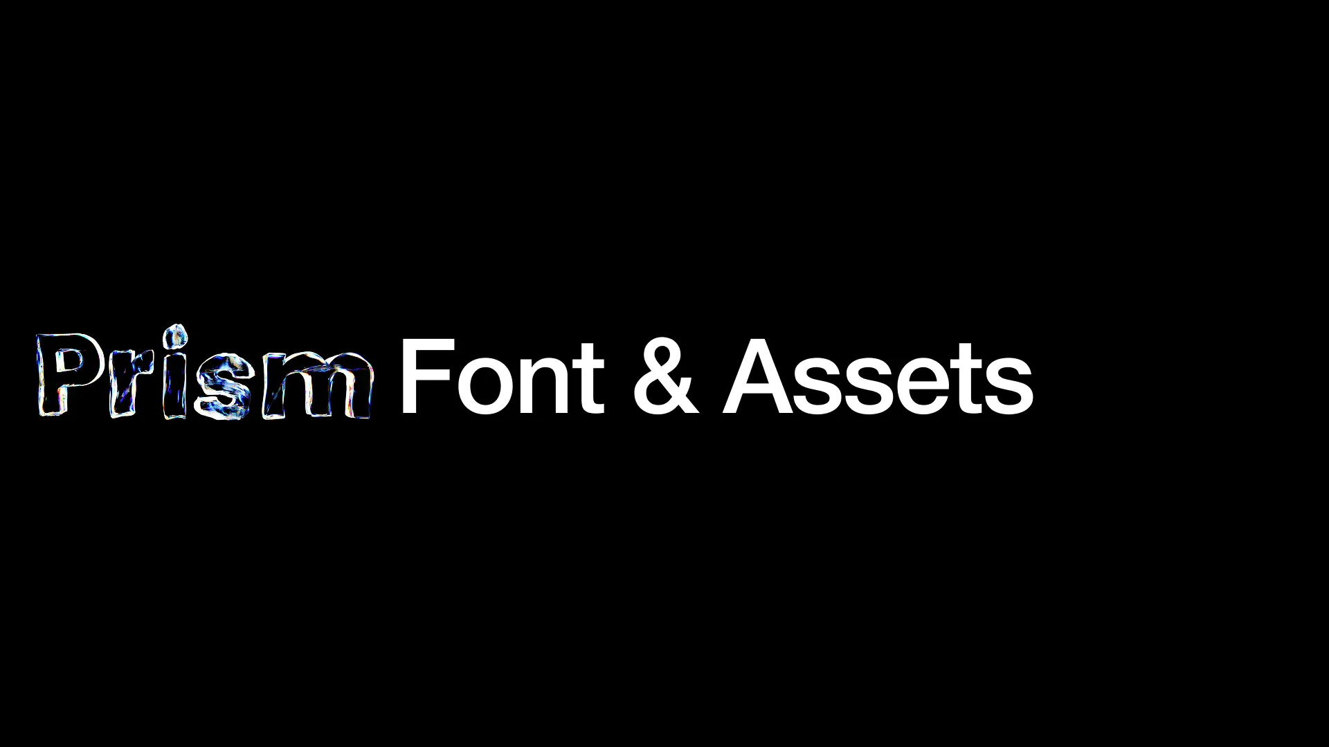
Prism Font & Assets
TYPEFACES, GRAPHIC
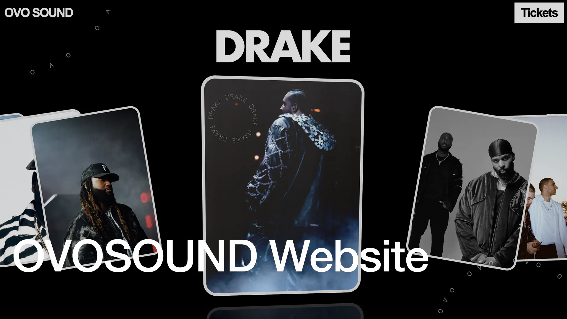
OVOSOUND WEBSITE
WEB/UIUX
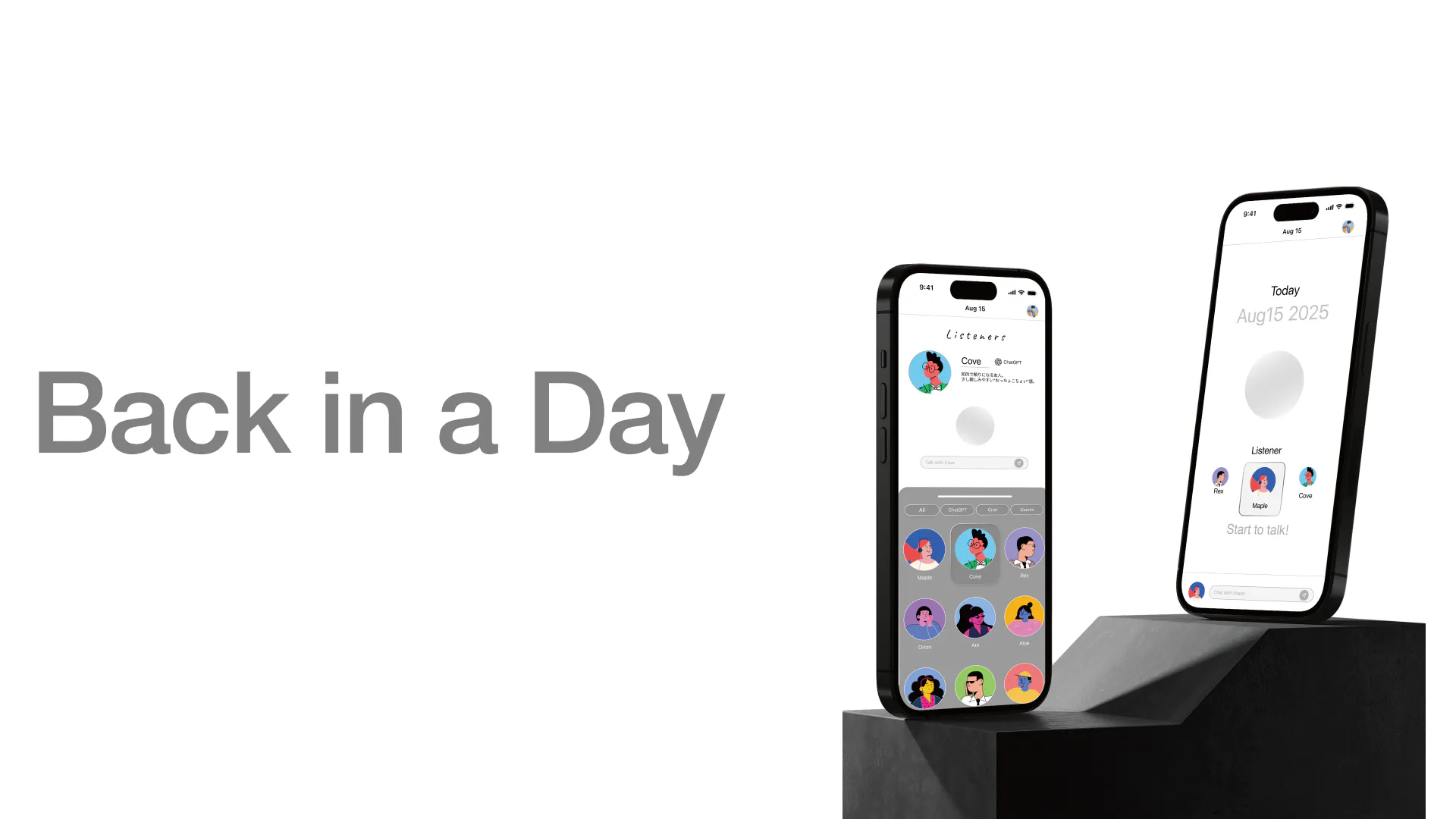
Back in a Day
WEB/UIUX
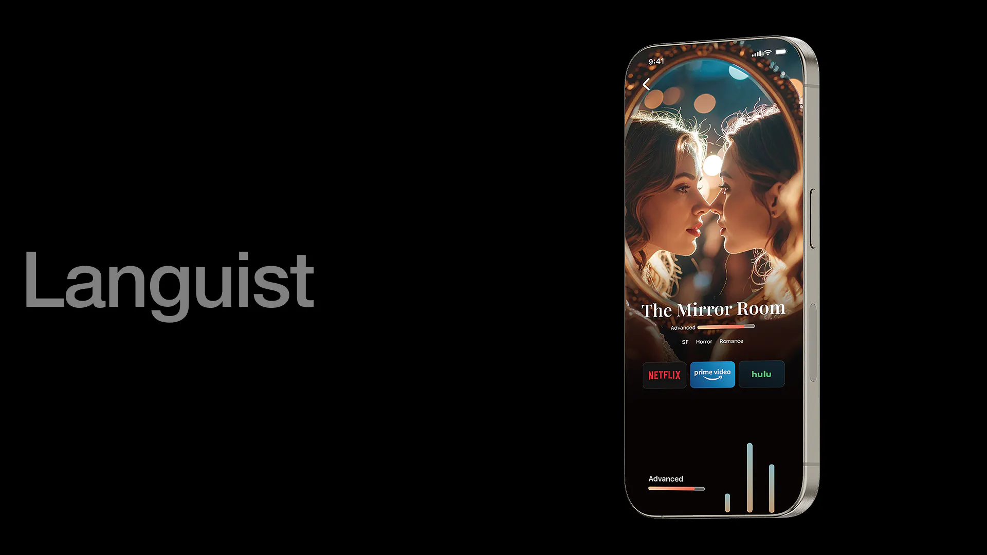
Languist
WEB/UIUX
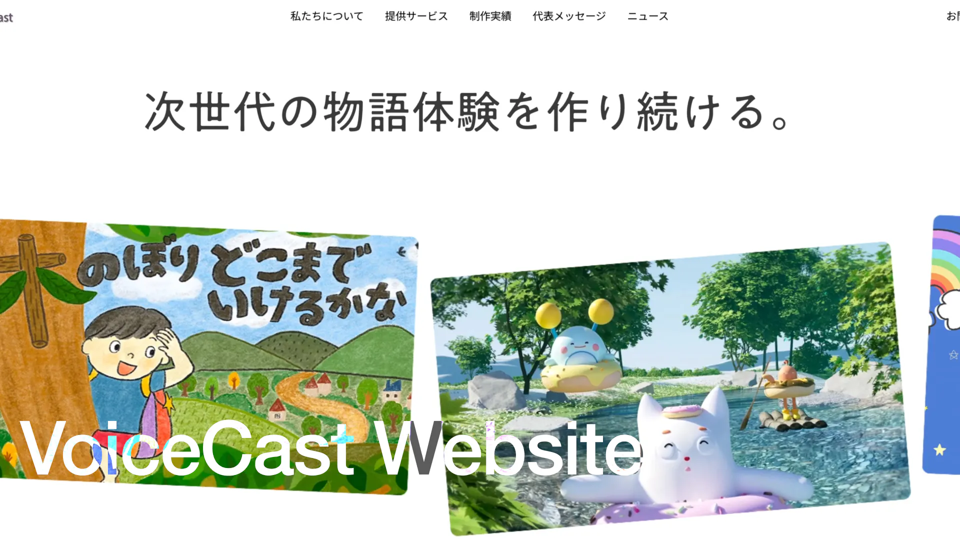
VoiceCast WEBSITE
WEB/UIUX, ClientWork
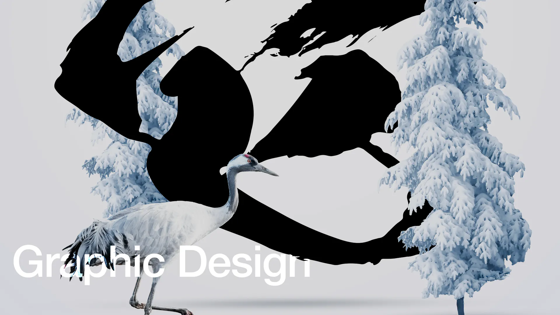
Graphic Design
GRAPHIC
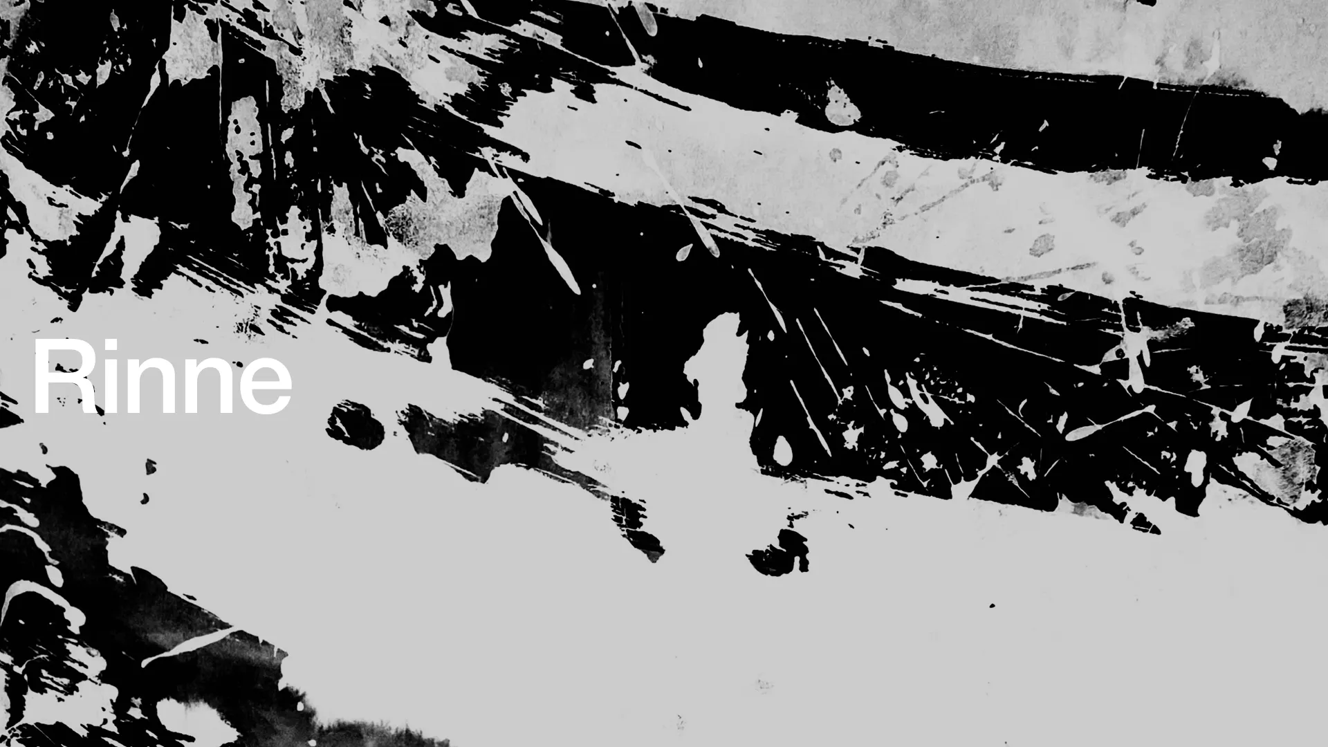
Rinne
DRAWING, GRAPHIC, BRANDING, Experimental Work

Rectangle Font
TYPEFACES
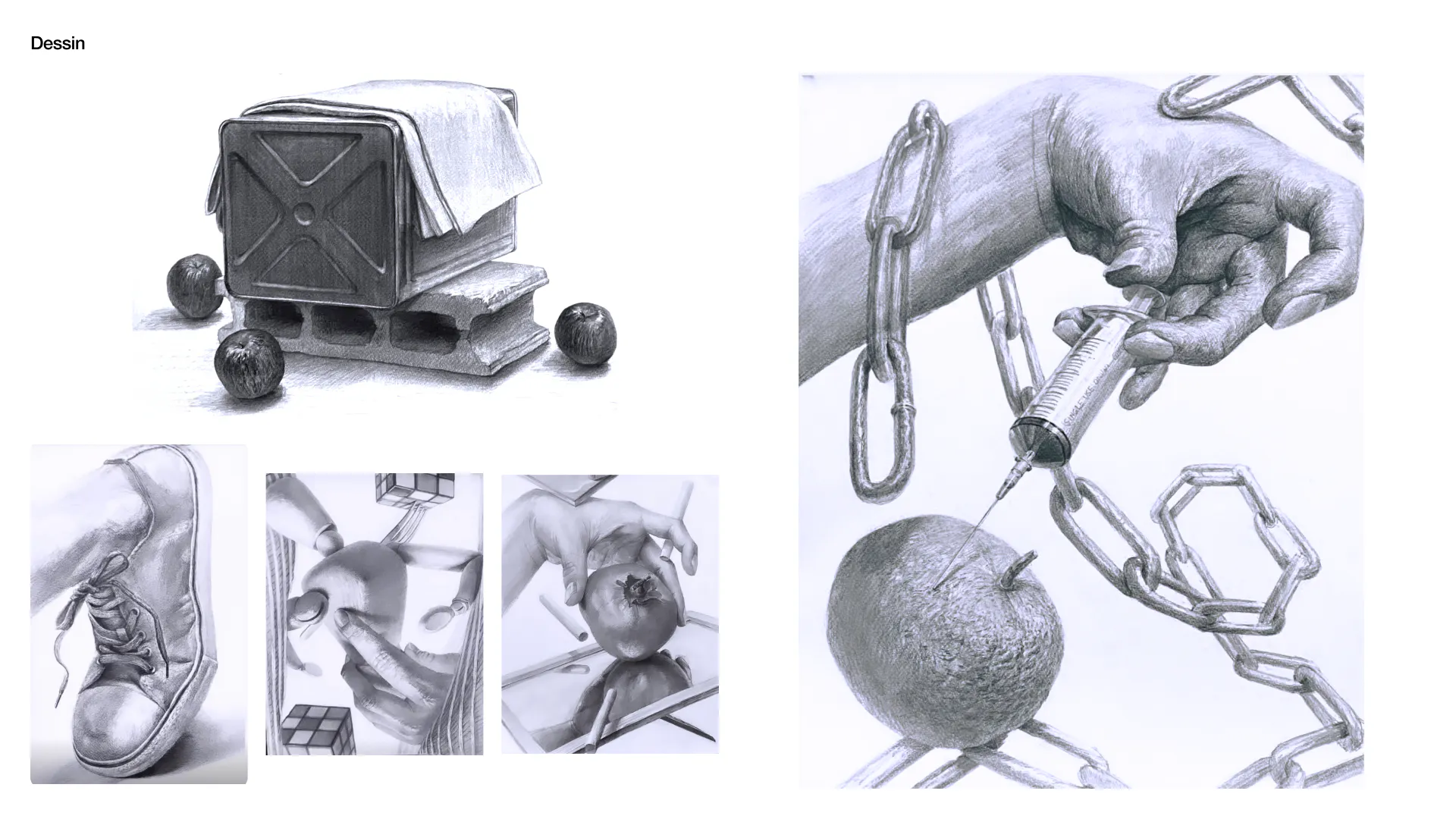
Dessin
DRAWING