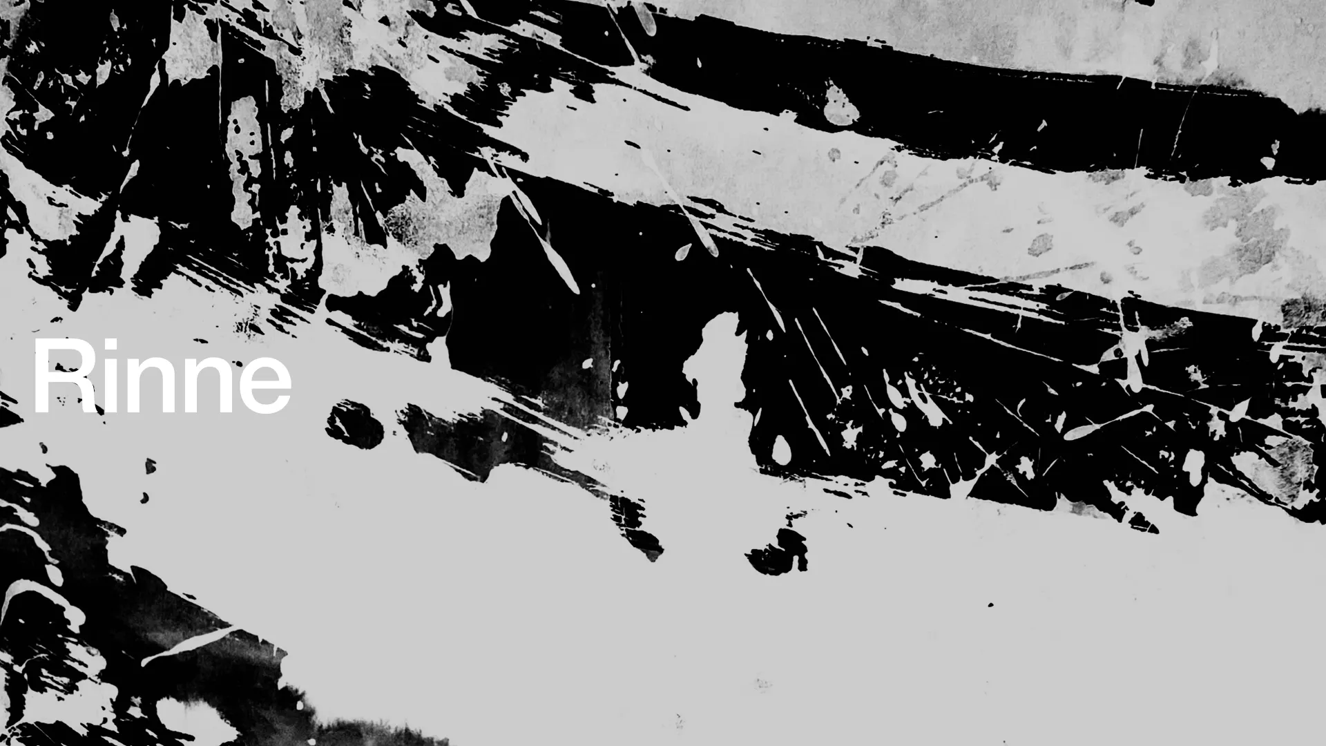
Rinne
Introduction
In class, I explore visual effects by creating brush-and-ink drawings on washi paper in a shared studio with about 50 students. I scanned the drawings, refined them in Photoshop, and reprinted them as physical works. I connected 50 pieces into one continuous sequence, treating them as a single line rather than separate lines.
Rinne - 輪廻 - means the endless cycle of death and rebirth in Buddhism.
I designed the front cover and the end cover can be connected so the title was named Rinne.

Drawing
First, we drew lines on paper using a brush and ink.
The materials created by each student were treated as shared assets that could be used by the entire class.

Correction
Once completing the drawings, we scanned the selected pieces and performed color correction in Photoshop. I inverted some of the materials from black to white, then printed them.

Connection
I connected the drawings into a single continuous line, creating a figure-ground reversal effect between black and white.

Branding
After creating these materials, the first idea that came to mind was to apply them to package design, as they reminded me of Japanese visual effects. This led to the concept of OKO, an incense brand inspired by seasonal Japanese flowers.
OKO is designed for Japanese people living and working abroad, providing them with a subtle reminder of Japan through scent.

First, I applied the black-and-white materials.

Then, I added color to evoke each season.
I adopted floral scents that correspond to each season.


FumiStudio WEBSITE
WEB/UIUX, BRANDING
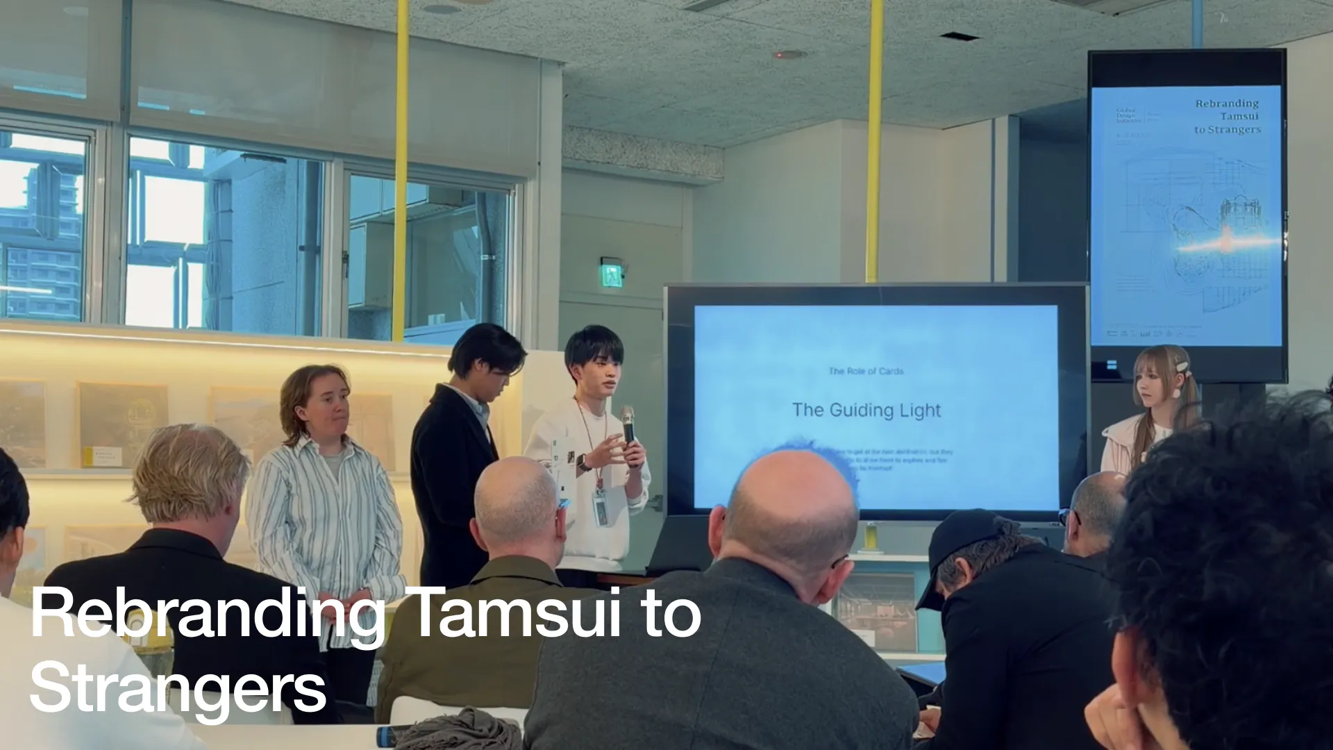
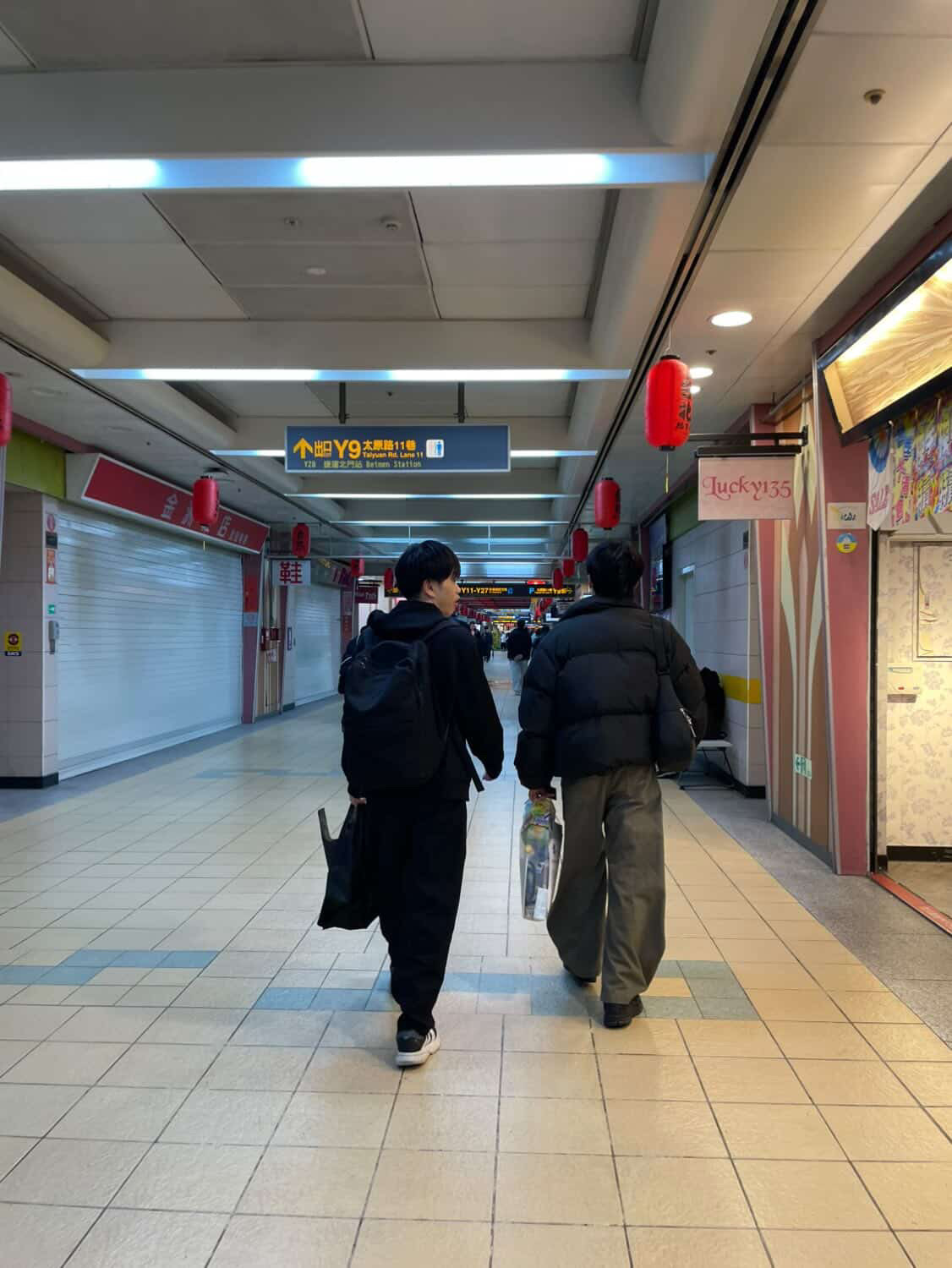
Rebranding Tamsui to Strangers GDI2026
BRANDING
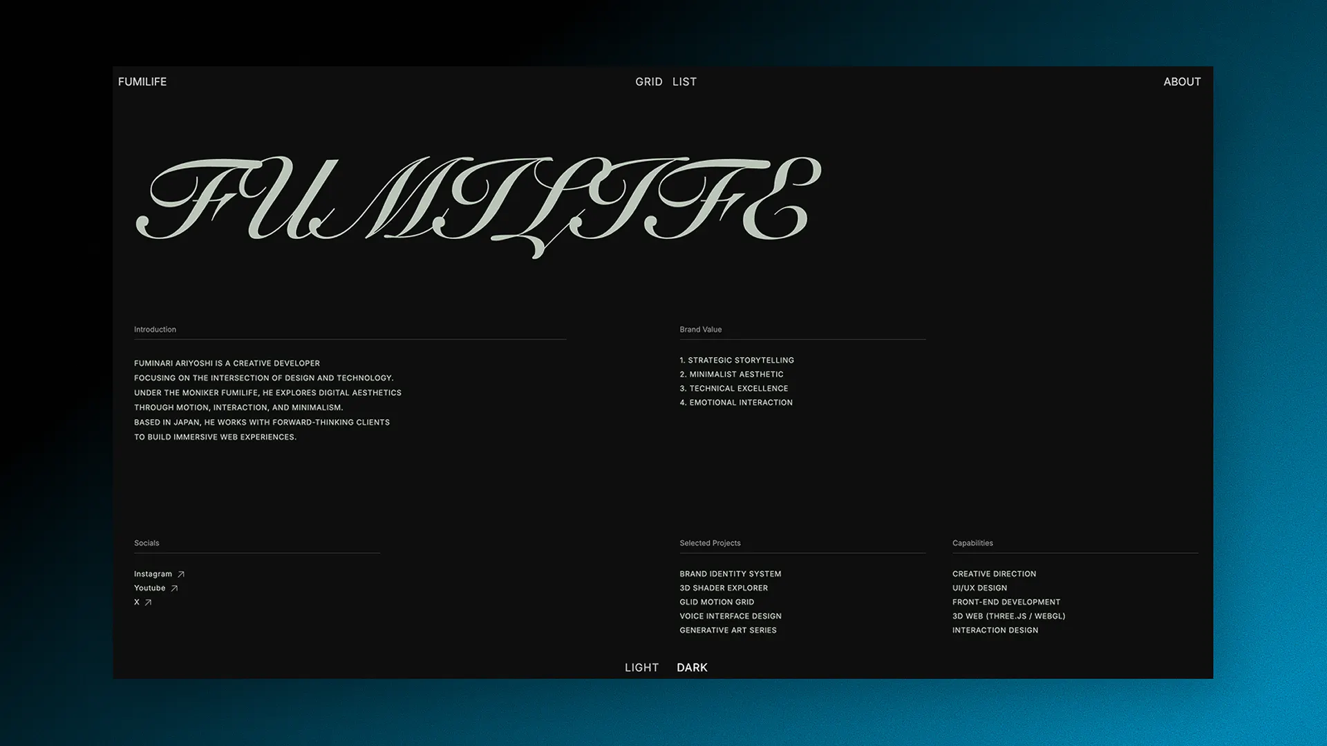
FumiLife Project
WEB/UIUX
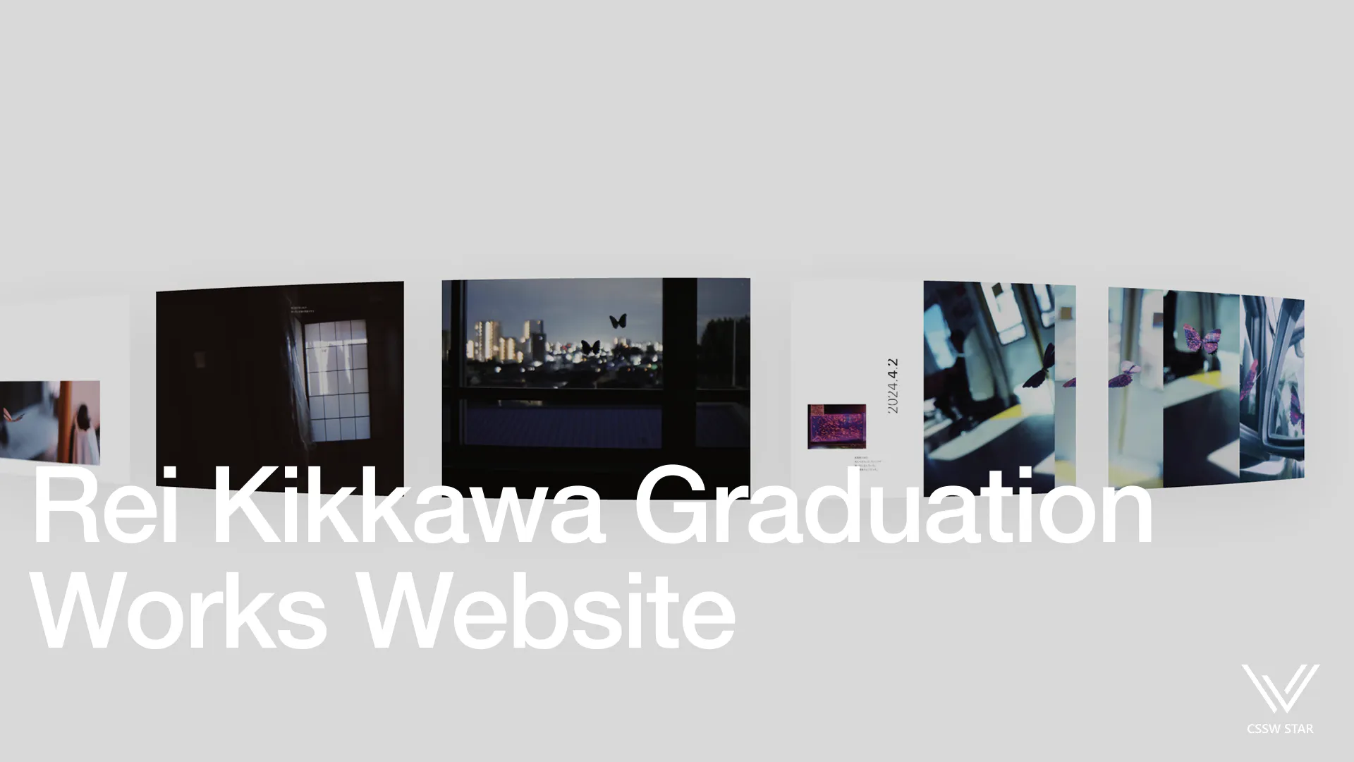
ReiKikkawa Graduation Work
WEB/UIUX, ClientWork
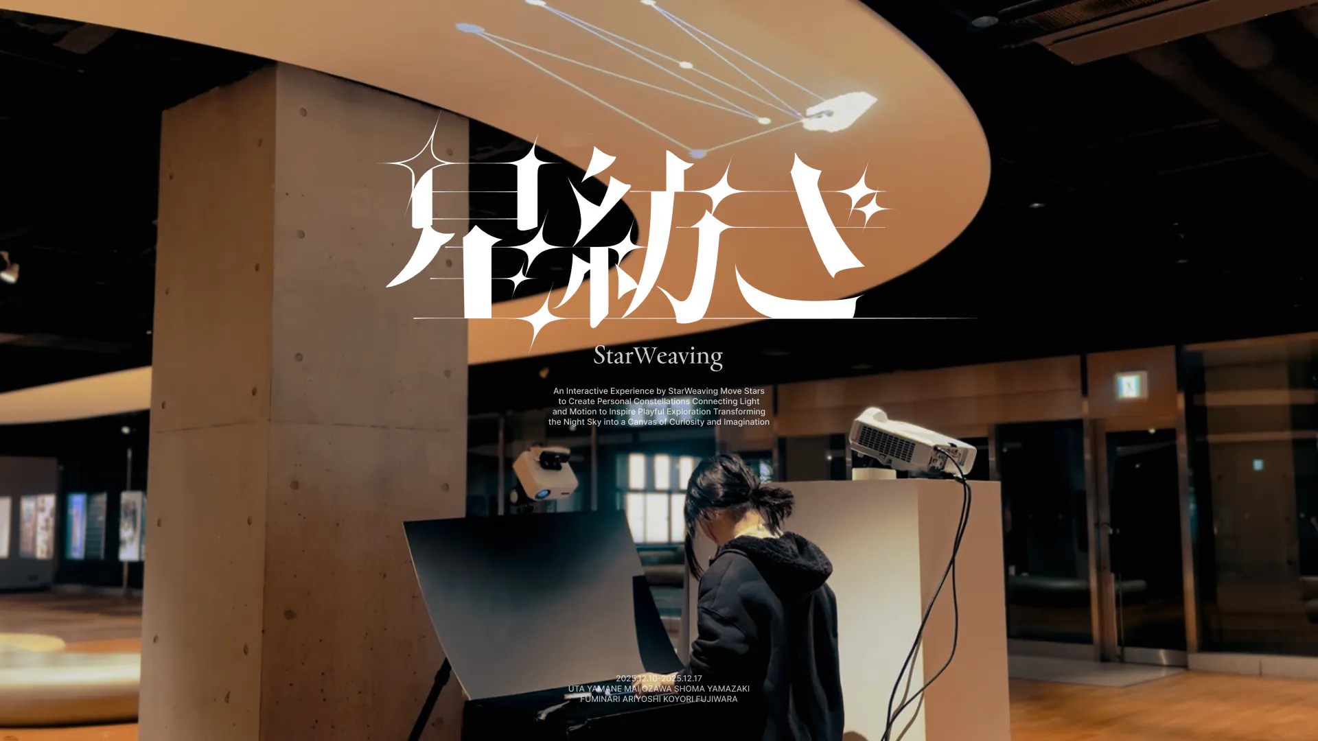
StarWeaving
BRANDING, Experimental Work
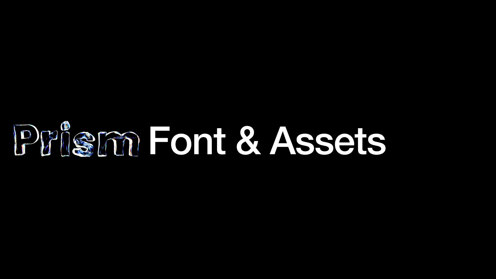
Prism Font & Assets
TYPEFACES, GRAPHIC

OVOSOUND WEBSITE
WEB/UIUX

Back in a Day
WEB/UIUX
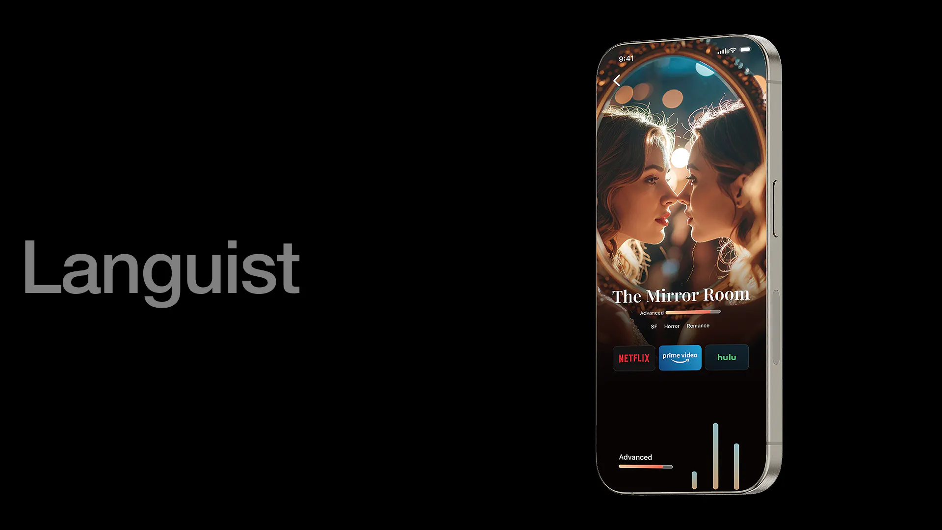
Languist
WEB/UIUX
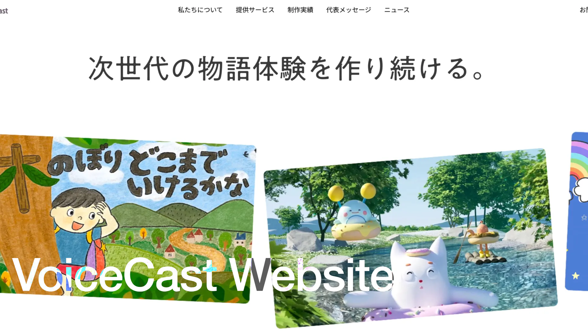
VoiceCast WEBSITE
WEB/UIUX, ClientWork
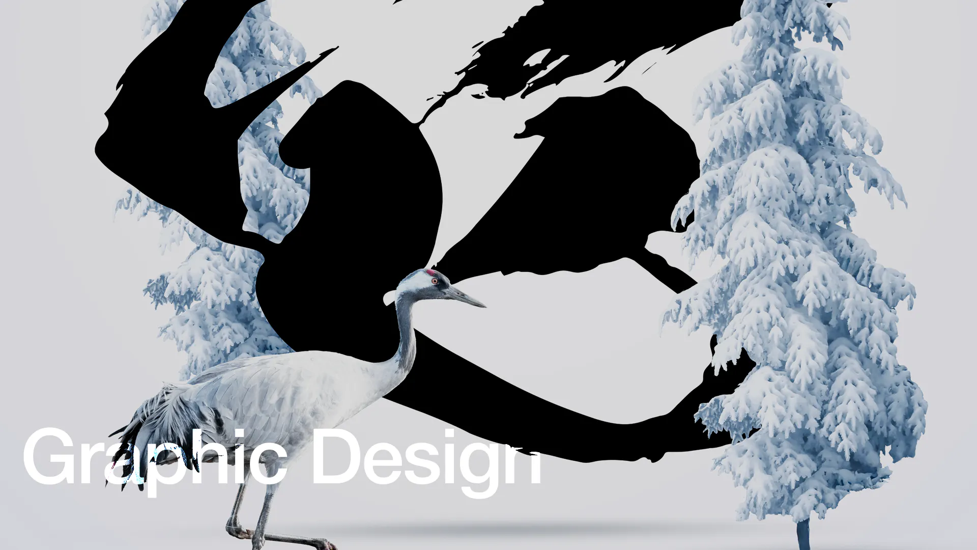
Graphic Design
GRAPHIC
Rinne
DRAWING, GRAPHIC, BRANDING, Experimental Work
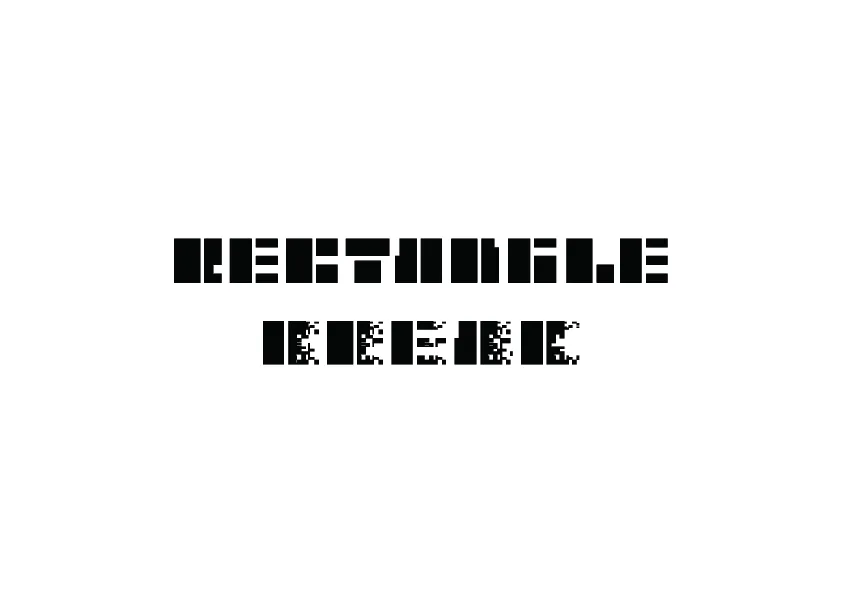
Rectangle Font
TYPEFACES
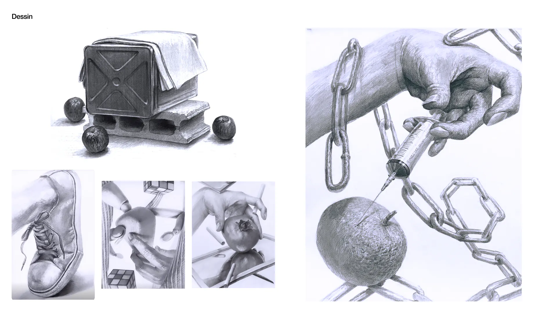
Dessin
DRAWING